Medela
Global website experience redesign
The Challenge
A global business that has an exceptionally well selling product over several decades suddenly finds itself competing with new digital-first brands with innovative products – such as Elvie.
How do you take a successful product-focused business – which is sold and distributed globally – and change the way they interact with their customers on a global platform?
My Role
(Hands-on) UX Director and internal Product Owner for Keel.
Project Length
6 months
Overview
Keel was tasked with changing the tone of Medela’s content to focus less on the product’s engineering and technical specifications – and more on their VIP user – new mums.
This new direction for Medela and drastic change in tone of content allowed us to use this as a cornerstone providing a foundation to a more engaging digital experience. My role was to define and design an experience that reflects this change and craft it in a way that would also be viable to roll out across multiple regions in every continent globally.
This 6-month project meant engaging with multiple people across product, marketing and senior management in Medela. I ran definition workshops with the team, helping them to define their key challenges, and align behind their potential solutions using techniques such as live wireframing, voting and sketching (think design sprint elements).
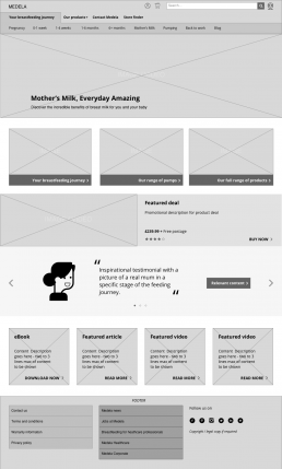
I was then responsible for re-engineering the IA of the site, and designing the experience across the full site, including the structure for all key pages, components and elements in both the ecommerce and content areas. This was done primarily using low-fi interactive prototypes in inVision, moving to hi-fidelity screens once signed off. I managed all aspects of the design, including the UI design team and demoing the concepts and final designs to the internal Medela product owners.
From wireframe to final design.
Want to dive a bit deeper?
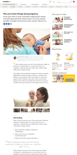
Restructuring from the human up.
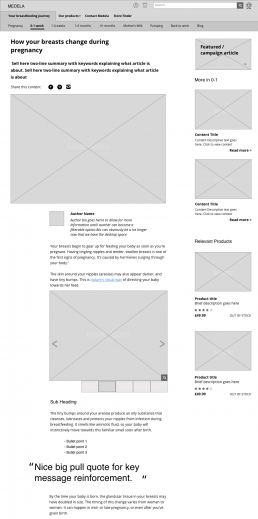
Very early on the team decided on restructuring the content on the website around the journey of a pregnancy to new mum – which was their key audience. Based on the research done by external consultants and the work with Keel, this was broken into significant milestones which became the core structure for the content side of the site.
Supporting instead of selling – a change in perception.
The previous content was either very much focused on the Medela product range, or very scientific and heavy. These pieces were often structured in a very text-dense, hard-to-consume way – with images that were not always relatable. And as with many product companies, the content was very internally focused, not always considering audience needs.
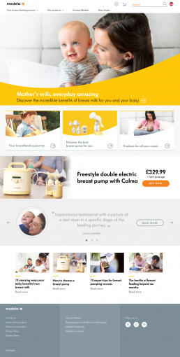
First up, Keel did an excellent job of producing content created with a focus on the mums – not the products – which allowed us to design a more editorial structure to the page layouts.
By designing this new overall structure and layout to reflect news content – using sites such as the Times and Guardian as inspiration – we presented it to give a more journalistic feel to build audience trust.
We created more whitespace, and broke up the content with off grid images. Other considerations were the ability to link references, and showing contextually relevant products to the audience.
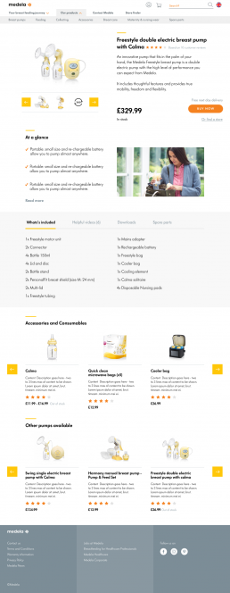
The right product – not ‘just’ the product
The overall structure of the product pages was complicated, information overload and very technical. Products were arranged in abstract taxonomies and the purchase journey far from easy. The reality was that most of their customers were large government contracts or sold instore or online through resellers.
I redesigned the product pages to focus on 2 key things – being a place that a customer might come to when making a purchase decision with a reseller and organised in a way that would allow easy comparison between products.
A clear structure to the page was created allowing potential customers to quickly find the most relevant information to them - and allow them to make a decision and purchase quickly.
What did it achieve?
The final structure, design and experience were initially implemented globally barring the US (which initially had a separate team and design, but as of putting this together has now taken on our solution). Medela started to see higher levels of engagement almost instantly, with much longer durations of users staying and consuming more content. There was an uptick in direct sales as well.
Internally there were some major benefits. From an efficiency point of view, by having a modular set of components, consistent navigational structure and visual alignment, more time was spent focusing on the what, not the how when it came to regional variance.